
.svg)

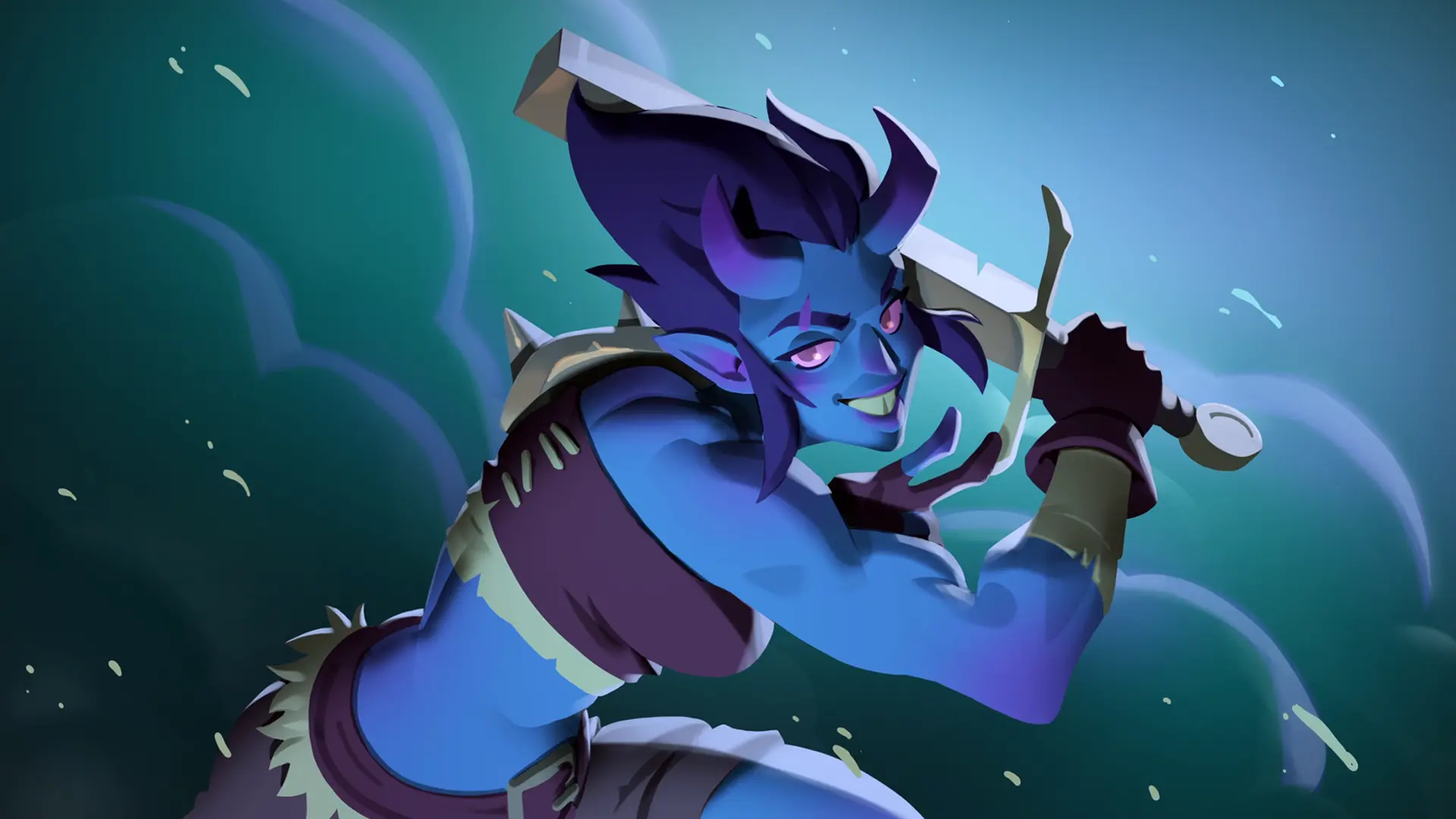
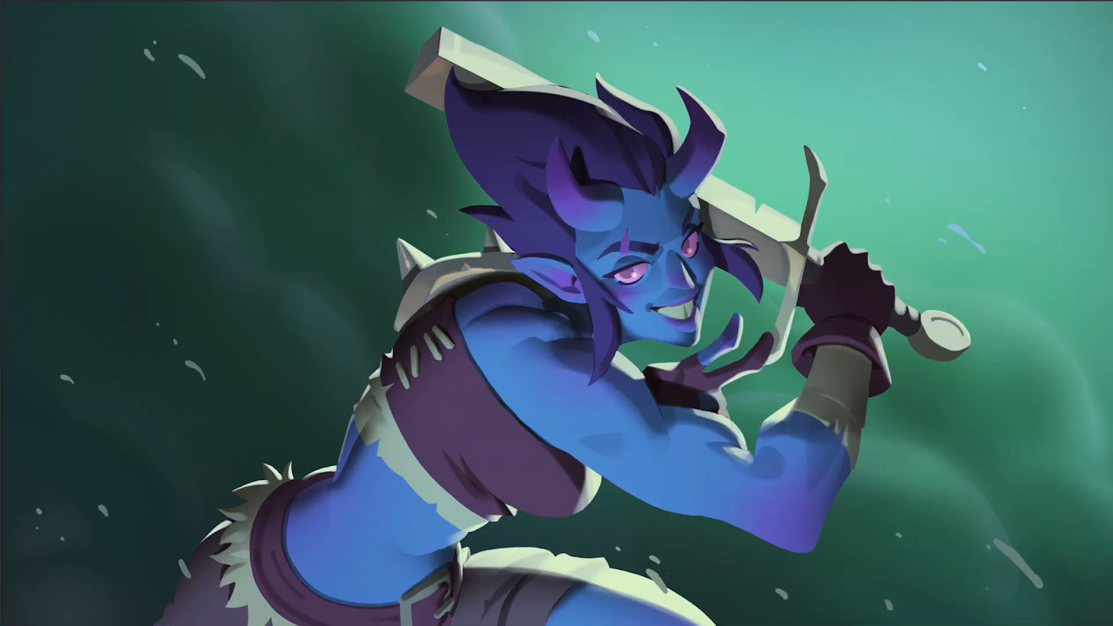
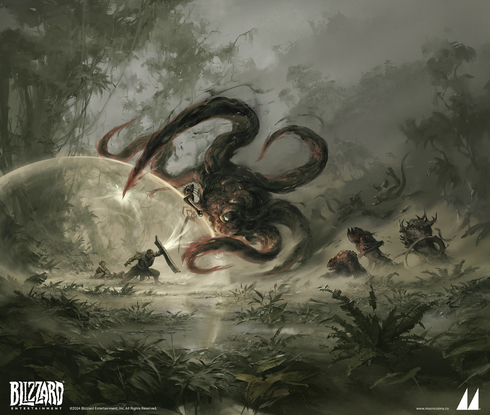
Featured article

Welcome to Lunar Academy
Greetings, intergalactic traveler. It seems the universe has led you to Lunar Academy 🌕
Never heard of us? We’re an online learning platform created by the premium concept art and illustration studio Mooncolony. We have just one mission: to give artists the skills they need to make it in the games industry.
What you’ve heard is true: this is a competitive sector. But if you have the drive, becoming a professional concept artist or illustrator is not a pipe dream. And we’ll help you get there 🚀

Why we created Lunar Academy
The artist’s journey can be a lonely and confusing one. And although there’s a lot (a LOT) of educational art content out there, it’s not easy to find trusted resources for learning industry-specific skills.
At Mooncolony, giving back to the art community is super important. We feel that we have a responsibility to help demystify our industry and allow up-and-coming artists to succeed. With Lunar Academy, we’re aiming to nurture the next generation of talent—so that ultimately, we can hire more awesome artists in the future 🤝
Learn from the galaxy’s best artists

Studying with Lunar Academy means learning from real, successful artists at the top of their game. You’ll learn tricks of the trade from the likes of Alexandre Leoni (@leoniarte), Milica Čeliković (@milicraft.psd), and Alex Pascenko (@alexpascenko), who are some of the industry’s best.
Every Lunar Academy mentor is a Mooncolony professional, working on game franchises such as World of Warcraft (Blizzard), The Elder Scrolls (Bethesda), Diablo IV (Blizzard), Clash Royale (Supercell), and many more. Our artists were all beginners once—they want you to avoid their early-career mistakes and get that dream job 🌠
On-demand courses in industry skills

Want to learn how professional game artists work? Our online courses are designed to give you the skills to flourish in this industry. Learn specialist topics such as character design and digital painting—or brush up on the fundamentals
.
You can do these courses in your own time, at your own pace. Each one is broken up into easily digestible chapters, and you’ll have homework tasks to get you started. All our courses have subtitles in English, Portuguese, French and Spanish 🌎
Super in-depth portfolio reviews

We want artists to get maximum value from our portfolio reviews. That’s why these sessions get you a full hour with a Mooncolony artist. They’ll listen to your goals, evaluate your work, and tell you exactly where you should focus next.
You can use the hour however you like—do you want an overall review of your portfolio? Or would you prefer feedback on a specific artwork, with a paintover? Perhaps a little job-hunting advice too? This review is a unique opportunity to take your career into your own hands 💪
Mentorships with real games artists

Ready to really turbocharge your skills? Our hugely popular mentorships offer 7 weeks of one-to-one guidance with a Mooncolony professional. Each mentorship is designed to give you studio-style experience, as though you were working for a real client.
In addition to providing tailored advice, your mentor will coach you through creating a showstopping artwork for your portfolio. These mentorships are designed to help intermediate or advanced-level artists break through skill plateaus, and reach a professional standard. It’s the ultimate boost to your employability.
Live online workshops
Want to learn specific skills directly from industry artists? In our live online workshops, groups of students hone in on learning one specialist topic—with the opportunity to ask questions and get direct feedback. Think of it as something between an on-demand course and a mentorship.
Students can choose between two tiers when booking, with Tier 1 students accessing in-depth feedback (usually with a paintover) as part of their workshop experience. This is a unique opportunity to spend two days intensively learning a specific skill, at a more accessible price than a mentorship 🎨
Get support on our Discord channel

Staying motivated and accountable as an artist isn’t easy. That’s why we’ve worked hard to build an awesome intergalactic community on Mooncolony’s Discord server. It’s a place to share your work, get feedback, and connect with thousands of fellow digital artists. See you there! 🧑🎨
Your next adventure awaits. Are you in?
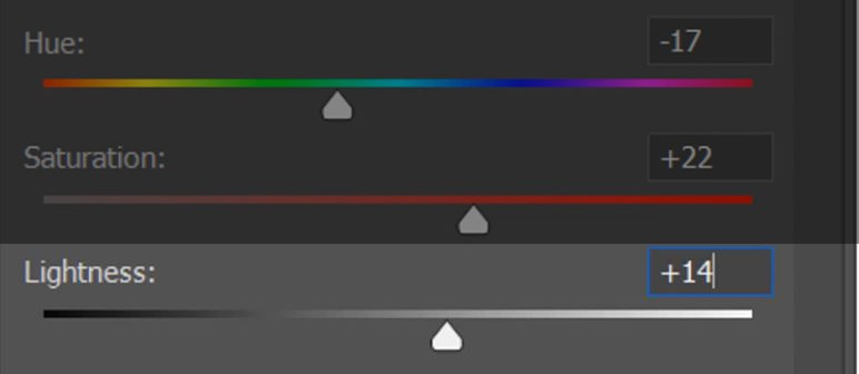
Hue, Value, and Saturation: The Holy Trinity of Color
Hue, Value, and Saturation: The Holy Trinity of Color
Have you ever spent hours designing a cool character, only to realize they’re fading into the background? Or made a fantastical environment that just ends up muddy? 😩
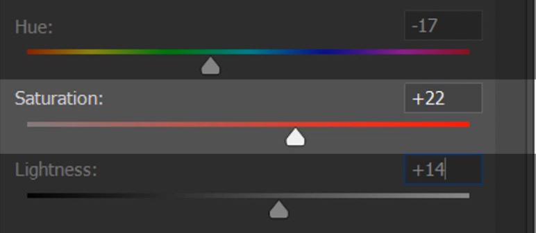
As a digital artist, you’ve probably heard of hue, value, and saturation. These are the three dimensions of color, and each can be the difference between an artwork that’s just okay, and one with serious impact.
Let’s break these three elements down in a way that makes sense—and more importantly, let’s talk about how you can use them to level up your art 💪

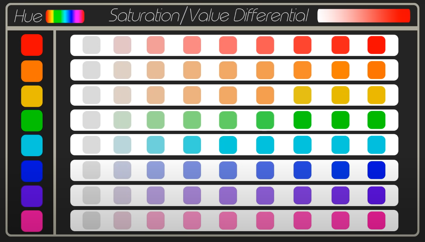
🎨 Hue: Which Color?

Simply put, hue refers to the name of the color itself. Red, blue, green, purple—these are all hues. Hue is especially important for storytelling, affecting the mood, emotion and symbolism within your artwork.
Digital hues (unlike paints) are made of light, allowing for a huge spectrum of colors that can be precisely adjusted. On the slider above, all the hues are in their purest form, at maximum saturation and neutral brightness.


🖌️ How Hue Affects Your Artwork:
- Color harmonies – Sticking to complementary (opposite on the color wheel) or analogous (next to each other) colors creates visual balance.
- Mood & storytelling – Warm hues (reds, oranges, yellows) feel energetic or intense, while cool hues (blues, greens, purples) evoke calmness or mystery.
- Character & environment readability – A good mix of distinct hues makes characters pop against backgrounds.
Tip: It’s much easier to create harmony and focus when you have a limited palette. Plan your color palette early, and you’ll avoid a chaotic image with out-of-control colors! 😵💫
🔦 Value: Light & Dark
Value (also referred to as ‘brightness’ or ‘lightness’) is all about how light or dark a color is. Imagine a grayscale version of your artwork—those shades of gray are the values. Even without hue, value alone creates depth, focus, and drama 💡
When it comes to readability, value is the #1 most important element to get right. When your image is converted to grayscale, you should be able to tell what’s going on instantly. This is why you’ll often see digital artists planning illustrations with grayscale thumbnails—they’re making sure they nail their values first!
🏆 Why Value Is King:
- Depth & contrast – Good value control creates a sense of realism by defining light sources and forms. Poor value contrast = muddy, unreadable images.
- Guiding the player’s eye – High contrast draws attention. If your main character blends into the background, players will struggle to focus on them.
- Works even in grayscale – If your composition looks solid in black and white, it’s a sign of strong value structure.
Tip: Squint at your artwork or use a grayscale filter to check your values. If things blur together, you need to tweak those light and dark areas 👁️
Different Hues = Different Values
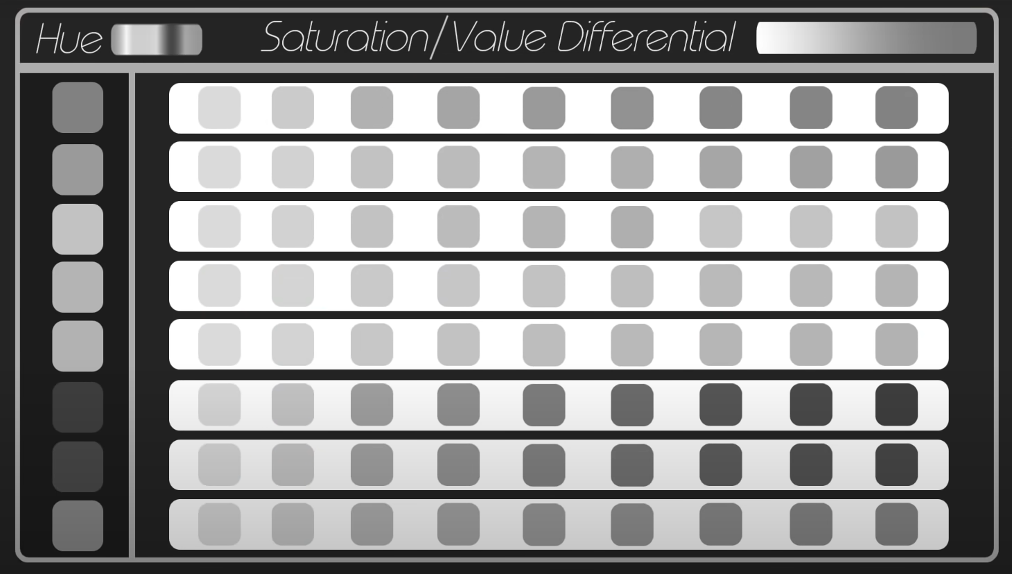
Another interesting value tip: when different hues are at maximum saturation, they possess different levels of inherent brightness. For instance, when viewed in grayscale, a pure yellow will be lighter than a pure blue. This is crucial to bear in mind when planning your value composition!
🌈 Saturation: How MUCH Color?
Saturation refers to how intense or muted a color is. Highly saturated colors are bold and vibrant, while desaturated colors are more subdued and closer to gray. Think of it as the difference between neon lights and foggy landscapes 🌁
Understanding saturation will help you create focal points, set the mood, and avoid overwhelming the viewer with too much intensity. The art direction of different games will also dictate how saturated your work is.
🎯 Why Saturation Control Matters:
- Focus & emphasis – A splash of saturation in a mostly muted scene immediately draws the eye.
- Atmosphere & realism – Due to atmospheric perspective, colors lose saturation as they recede into the distance. Use this trick to add depth to environments.
- Balancing realism and stylization – Over-saturated artwork can feel cartoonish, while under-saturated work can feel dull. You’ll need to find a balance depending on the style you’re going for.
Tip: Reserve your most saturated colors for areas of interest. For a character’s glowing sword, crank that saturation. Dial it way down for a dark, misty background 😶🌫️
🚀 Bringing It All Together: The Power Trio in Action

Think of hue, value, and saturation as a three-part harmony. If one is off, the whole piece can feel disjointed.
- If your colors feel wrong, rethink your hues.
- If your painting looks flat, check your values.
- If your scene feels too chaotic or too dull, adjust your saturation.
Whether you’re a concept artist or an illustrator, understanding these three elements is crucial to getting your work to a professional level. Mastering them isn’t about following rigid rules. It’s about understanding how they work together to guide the viewer’s eye and tell a compelling visual story.
The more you practice, the more intuitive it will become. And before you know it, you'll be making colors work for you, not against you! ✨
Need help mastering the art of digital painting? Join legendary game artist Alexandre Leoni in his beginner-friendly course Digital Painting 101 here, and develop a rock-solid professional painting process.
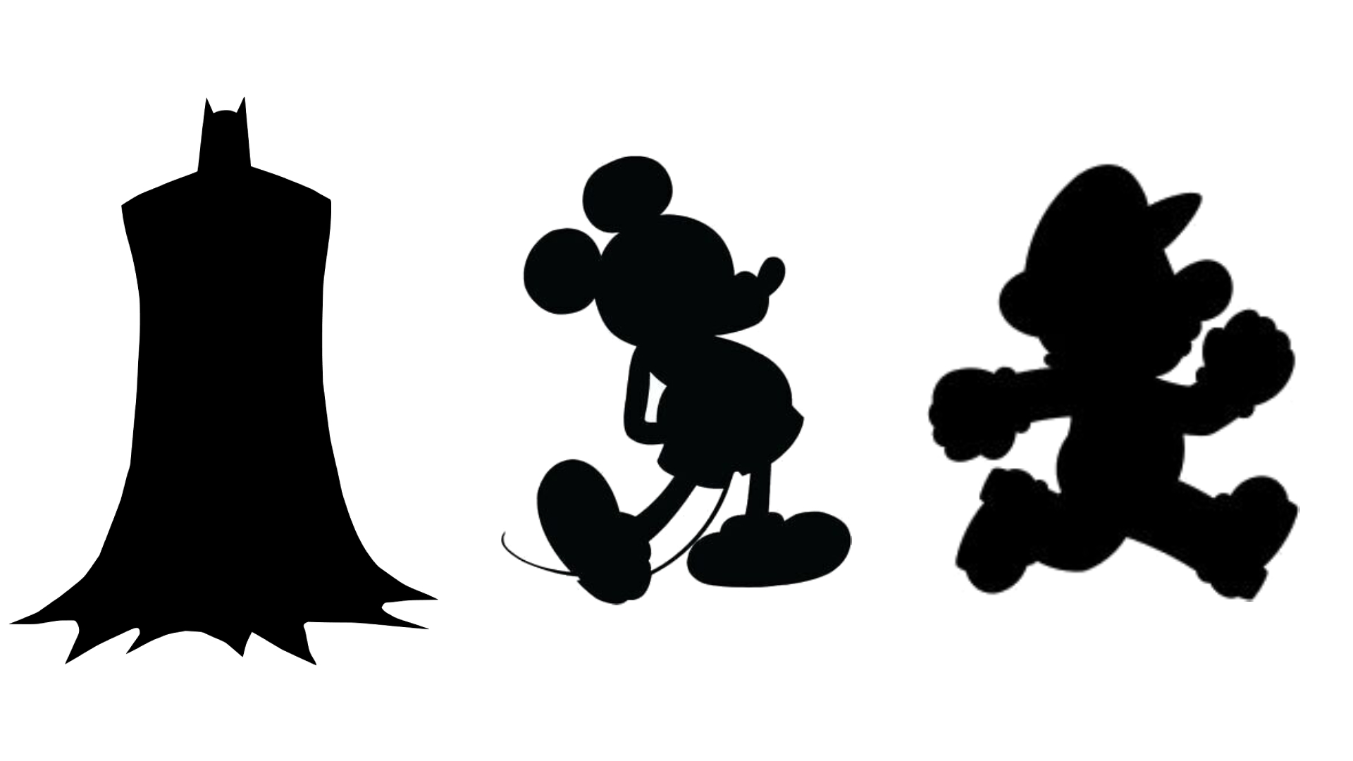
What Is Your Character's Silhouette Telling You?
What do Batman, Mickey Mouse and Mario all have in common? 🤔
All these iconic characters strike a strong silhouette. You can instantly recognize them from their blacked-out shapes alone. These silhouettes mean the characters remain clear and readable, whether they’re far away, in low light, or in busy scenes.
Do you want to make more attention-grabbing character designs? Read on—we’re going to discuss the power of the silhouette and reveal how to make yours stronger 🚀
👁️ What Silhouettes Can Tell a Viewer
A silhouette can convey all kinds of things about your character: their personality, mood, intent, even their role in the wider story. For example, broad shoulders and a confident pose help indicate a strong, brave hero character 🦸🏻
Be intentional about the shape of a character’s body and the stance you present them in. Try not to get lost in minor details early on. A silhouette alone should convey intentions and feelings—before you fill in the details!
📖 Enhancing Readability
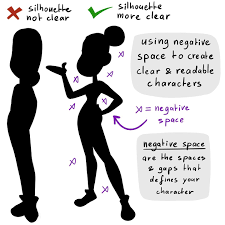
It’s important to ensure that your character’s silhouette is readable—in other words, easy to understand. Making use of negative space will help define their form and features. Create plenty of shapes and gaps around your character’s outline, instead of squashing them up 🤏
When your character’s pose is opened up like this, it’s easier for the brain to figure out what’s going on, even when all the details are filled in. When you’re designing, keep checking the black silhouette of your character to make sure it’s readable!
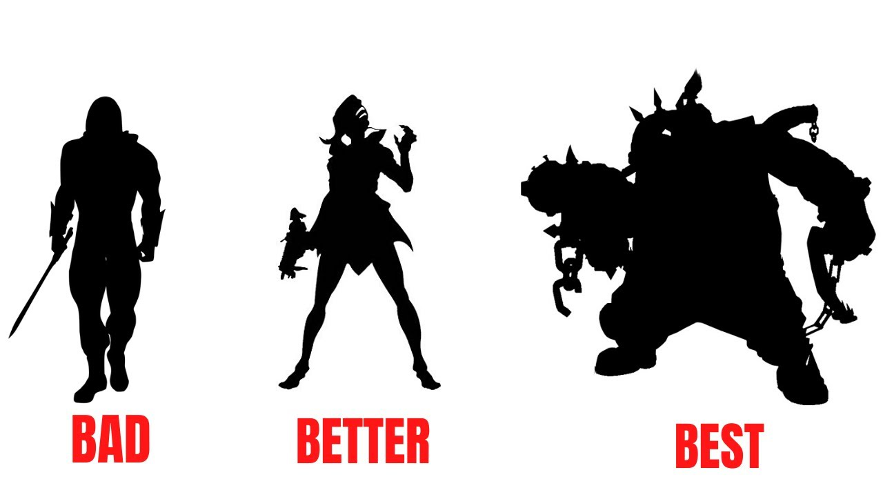
💥 The Power of Shape Language
Something that’s essential to convey in a silhouette is shape language. This is a powerful way to communicate your character’s inherent traits by giving the viewer instinctive visual clues. Shape language is widely understood across global cultures, because it taps into the subconscious parts of the brain 🧠
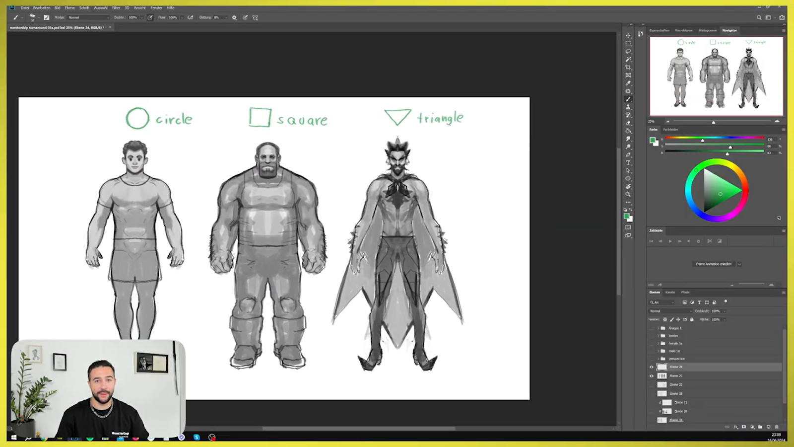
Circles
Circles lack sharp edges, making them feel welcoming and non-aggressive. They have a sense of fluidity and ease. Round characters feel:
- Soft
- Friendly
- Safe
- Gentle
- Warm
- Organic
Squares
Squares are balanced and stable, with rigid edges and straight sides. This makes them solid, inflexible and strong. Square characters feel:
- Resilient
- Strong
- Reliable
- Stubborn
- Slow
Triangles
The diagonal lines and sharp points of a triangle suggest dynamism, movement, and danger. In many cultures, triangle signs are warnings! Angular characters feel:
- Dangerous
- Dynamic
- Fast
- Aggressive
- Powerful
⚖️ Symmetry Versus Asymmetry
Something else to think about in your character’s silhouette is the concept of symmetry and asymmetry. Symmetrical characters often represent balance, harmony, and order. You’ll often see kings and queens designed very symmetrically, with a lot of straight vertical lines 👑
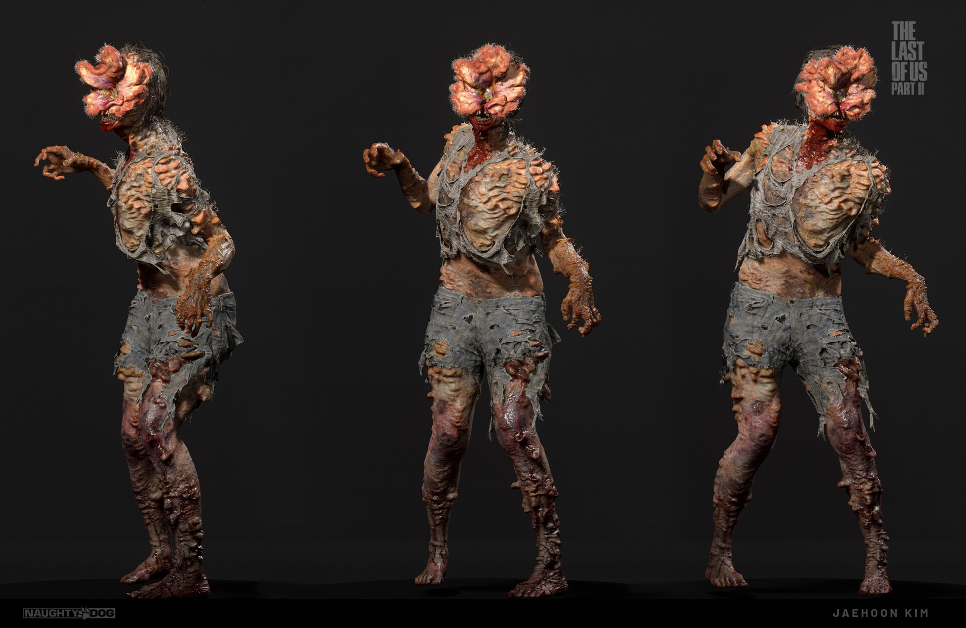
Asymmetry, on the other hand, represents chaos, unpredictability, and dynamism. Consider the orderly character of a king contrasted with the zombies overrunning his kingdom. Their crooked stances and bedraggled appearance are reflective of their danger 🧟
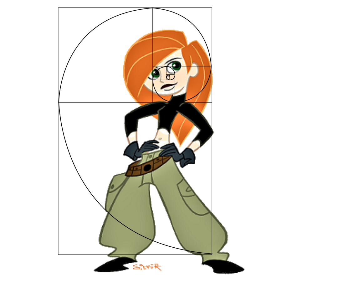
🪄 Mastering the Golden Ratio
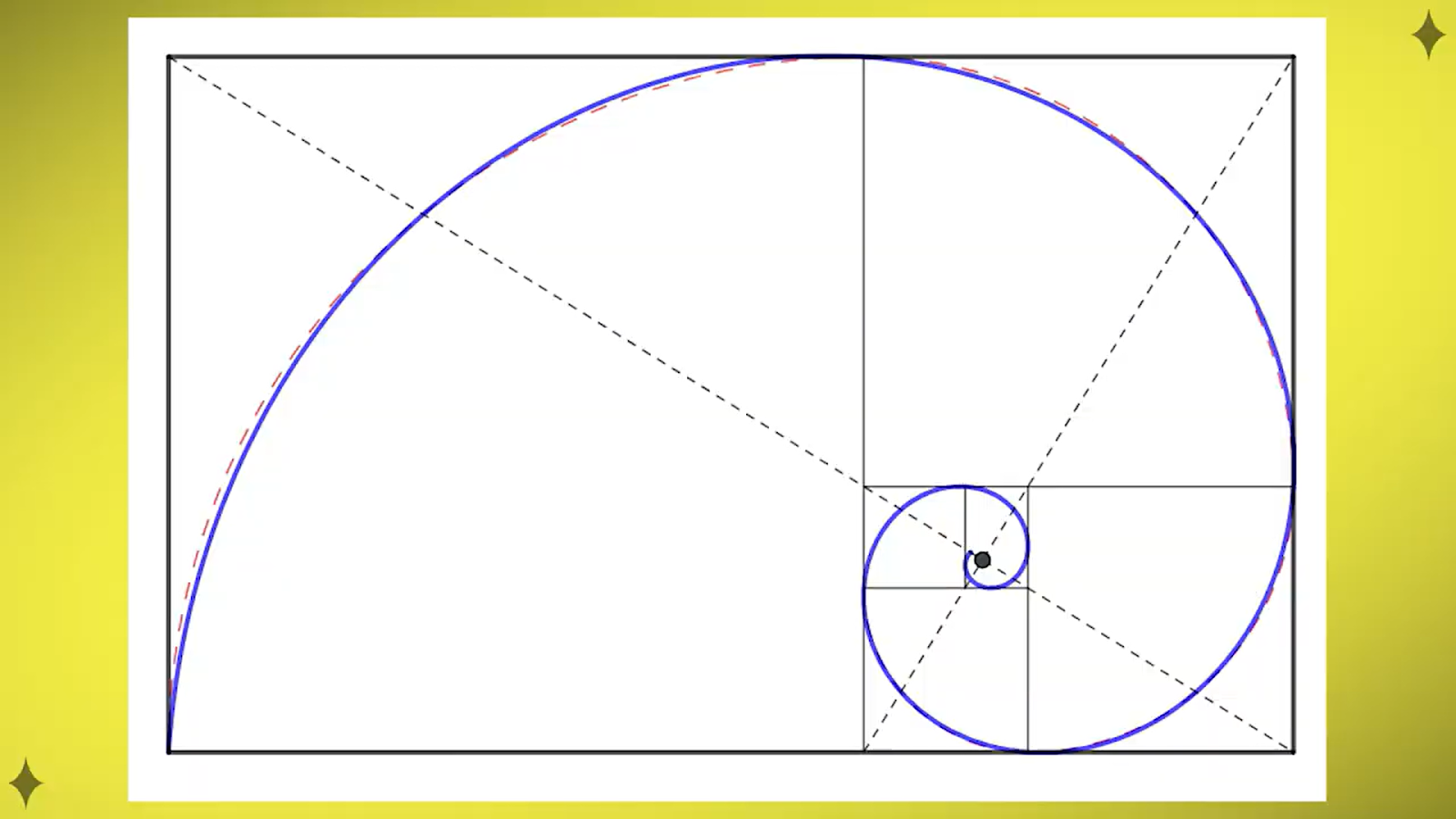
One final thing to consider when designing your character’s silhouette is the golden ratio. You might know it as the Fibonacci sequence or the divine proportion. This ratio is commonly found in nature, and when used in a design, it creates organic and natural-looking compositions.
Don’t be intimidated—simply put, this ratio gives you the ‘small, medium, and large’ components of your character. By giving the viewer areas of focus (small) and areas of rest (medium and large), your design will be more balanced and harmonious ✨
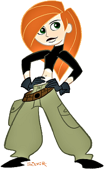
Stephen Silver, who designed Kim Possible above, called the golden ratio his ‘secret weapon of character design’. Kim’s design may seem simple, but it’s perfectly harmonious:
- Most of the design details and high-contrast areas are in the small area of the character’s face. This creates a strong focal point.
- The torso (medium area) is less busy, but still high-contrast with the light and dark areas.
- The legs (largest area) provide a low-contrast midtone area for the eyes to rest.
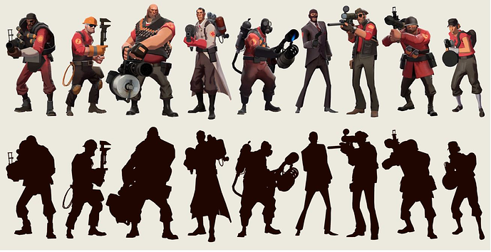
🔍 Analyzing Silhouettes
Now that you’ve learned a few character design tricks, take a look at the silhouettes of some of your favorite characters. What shape language is going on there? Are they symmetrical or asymmetrical? Do any of them use the golden ratio?
By analyzing the silhouettes of successful character designs, it becomes easier to apply these learnings to your own work. So next time you sit down to draw, don’t forget to think about silhouette—your designs will be more memorable for it! 💪
Are you an aspiring character designer? You need Believable Character Design, the masterclass by Mooncolony Art Director Alex Pascenko. Get access to industry secrets and learn professional skills in this online course ⚔️
Digital Art Portfolio Dos and Don’ts
What are the most common mistakes artists make with their portfolios? Our team has conducted a LOT of portfolio reviews, and certain things come up again and again!
When crafting your online portfolio, it pays to see things through the eyes of a recruiter. Mooncolony’s hiring team often sees promising artists held back by poor portfolio choices: a lack of clarity, using outdated work, or other common turn-offs 😩
This list of dos and don’ts was created in close collaboration with Mooncolony recruiters. Don’t worry, even experienced artists are prone to lots of these! Make sure your portfolio ticks all these boxes and ensure you’re putting your best foot forward 👇
Do:
- Use a portfolio hosting site like ArtStation. It will make your portfolio clean, professional, and easily navigable. It will also make you more discoverable to recruiters.
- Include your personal info. Add links to your social media profiles (especially LinkedIn), your email address, and a concise bio. Recruiters will Google you anyway, so help them out 🔎
- Tag your work. Recruiters are using the search function to find you, so make sure your art comes up in the results! Add plenty of relevant tags to your projects, describing the style, genre, and subject.
- Curate your thumbnails and banner image. These should draw the viewer’s interest, so crop them to focal areas such as faces. Add IP logos to your thumbnails where appropriate. If it’s fanart, make sure that’s clearly stated.
- Show your creative process. Design sheets, thumbnail options, speedpaint GIFs, and other process images help demonstrate how you arrived at your final artwork.
- Stay fairly consistent in your style and specialisms. Your portfolio should clearly show your personal style and the work you like doing. If you have multiple interests, it’s okay to have a variety of disciplines in your portfolio—but stay critical about what your best work is.
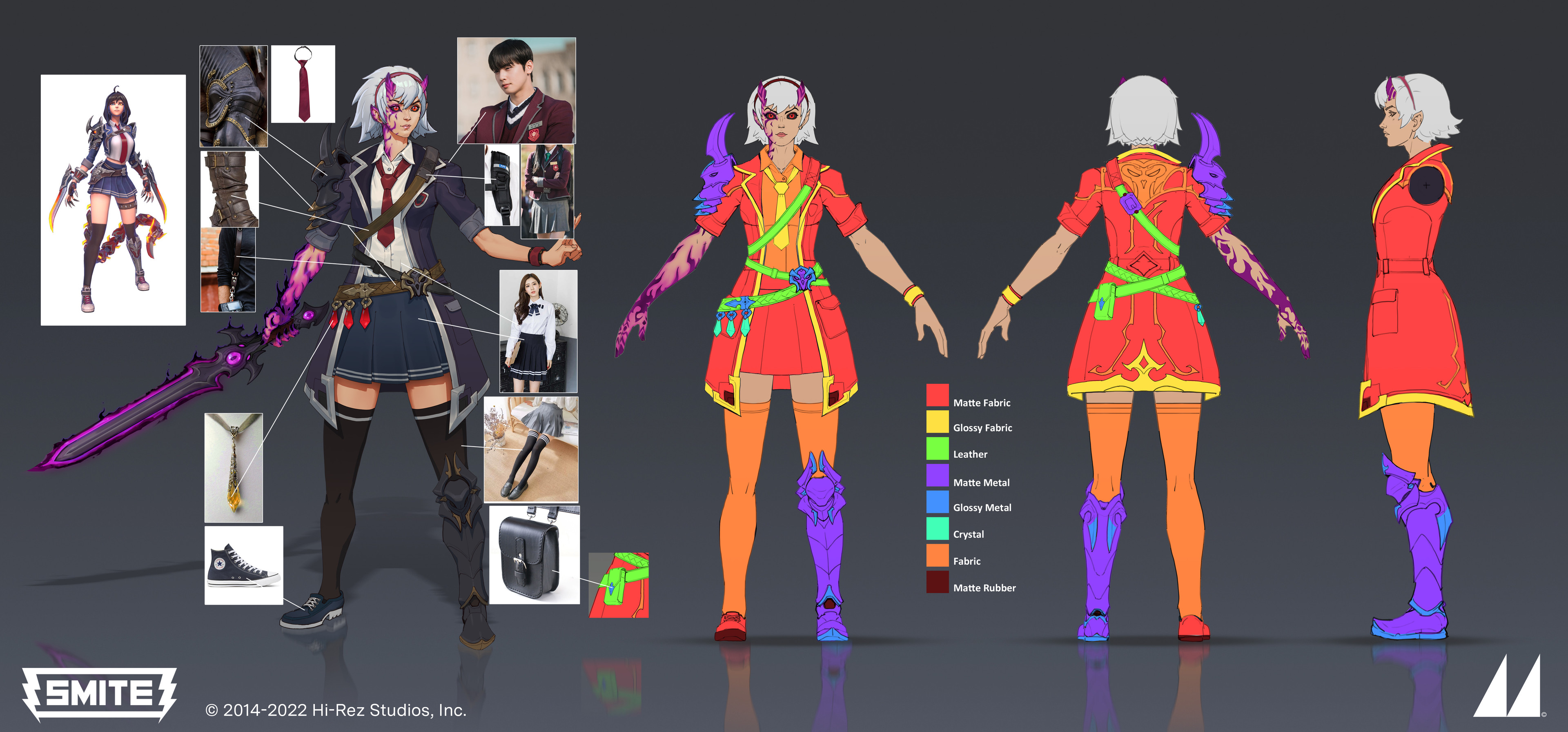
- (For concept art)—solve design problems. Show how your designs work, how the different parts move and fit together, what materials they’re made of, and how they look from multiple angles. This shows regard for 3D artists and animators.
- Like and follow other artists. If those artists return the favor, recruiters might find you in their follow list or likes. It always pays to build your network 👪
Don’t:
- Keep old work. This is our most common feedback when we give portfolio reviews. If you have improved significantly, and an older piece doesn’t match the quality of your current work, it’s time to get rid of it.
- Hide multiple polished images behind one thumbnail. If you have to click on a project and scroll down to see a piece, it might get missed. Ensure all your best work is visible from the main page of your portfolio.
- Include types of work you don’t want to do. It will distract from your preferred specialisms, and potential employers might see this as a reluctance to expand your processes in the future.
- Show unfinished work. If you didn’t have time to polish your work before a deadline (e.g. for a competition), there’s no reason why you can’t keep working on it for your portfolio. Recruiters will assume that all the artwork in your portfolio is finished.
- Build a portfolio based on what’s trending, or what you think will get you work. You’ll only end up getting jobs that you don’t enjoy. Do what you love the most! You’ll make your best art when you’re having fun anyway 🎉
.jpg)
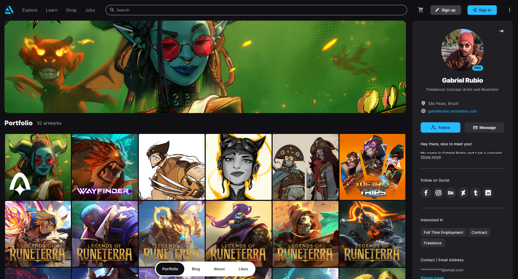
Looking for guidance on how to craft the perfect professional portfolio? Don't forget that our team offers in-depth portfolio reviews from legendary artists such as Gabriel Rubio, Alexandre Leoni. Emrah Elmasli, and more.
Check out the current offerings here and sign up to get focused advice to power up your portfolio and get noticed. 💪 And subscribe to our newsletter to get more tips, tricks, and advice to help level up your art.
Don't forget our summer sale is live until September 9th! Get 25% off ALL courses today with code SUMMER25.
Join our Discord


.svg)