
.svg)
Estimated read time
Tutorials & Techniques
November 6, 2025
Hue, Value, and Saturation: The Holy Trinity of Color
Hue, Value, and Saturation: The Holy Trinity of Color
Have you ever spent hours designing a cool character, only to realize they’re fading into the background? Or made a fantastical environment that just ends up muddy? 😩
As a digital artist, you’ve probably heard of hue, value, and saturation. These are the three dimensions of color, and each can be the difference between an artwork that’s just okay, and one with serious impact.
Let’s break these three elements down in a way that makes sense—and more importantly, let’s talk about how you can use them to level up your art 💪

🎨 Hue: Which Color?

Simply put, hue refers to the name of the color itself. Red, blue, green, purple—these are all hues. Hue is especially important for storytelling, affecting the mood, emotion and symbolism within your artwork.
Digital hues (unlike paints) are made of light, allowing for a huge spectrum of colors that can be precisely adjusted. On the slider above, all the hues are in their purest form, at maximum saturation and neutral brightness.


🖌️ How Hue Affects Your Artwork:
- Color harmonies – Sticking to complementary (opposite on the color wheel) or analogous (next to each other) colors creates visual balance.
- Mood & storytelling – Warm hues (reds, oranges, yellows) feel energetic or intense, while cool hues (blues, greens, purples) evoke calmness or mystery.
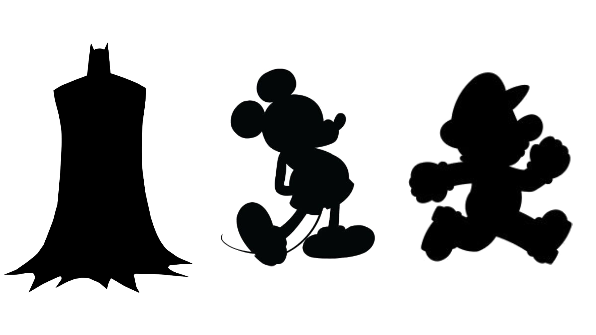
- Character & environment readability – A good mix of distinct hues makes characters pop against backgrounds.
Tip: It’s much easier to create harmony and focus when you have a limited palette. Plan your color palette early, and you’ll avoid a chaotic image with out-of-control colors! 😵💫
🔦 Value: Light & Dark
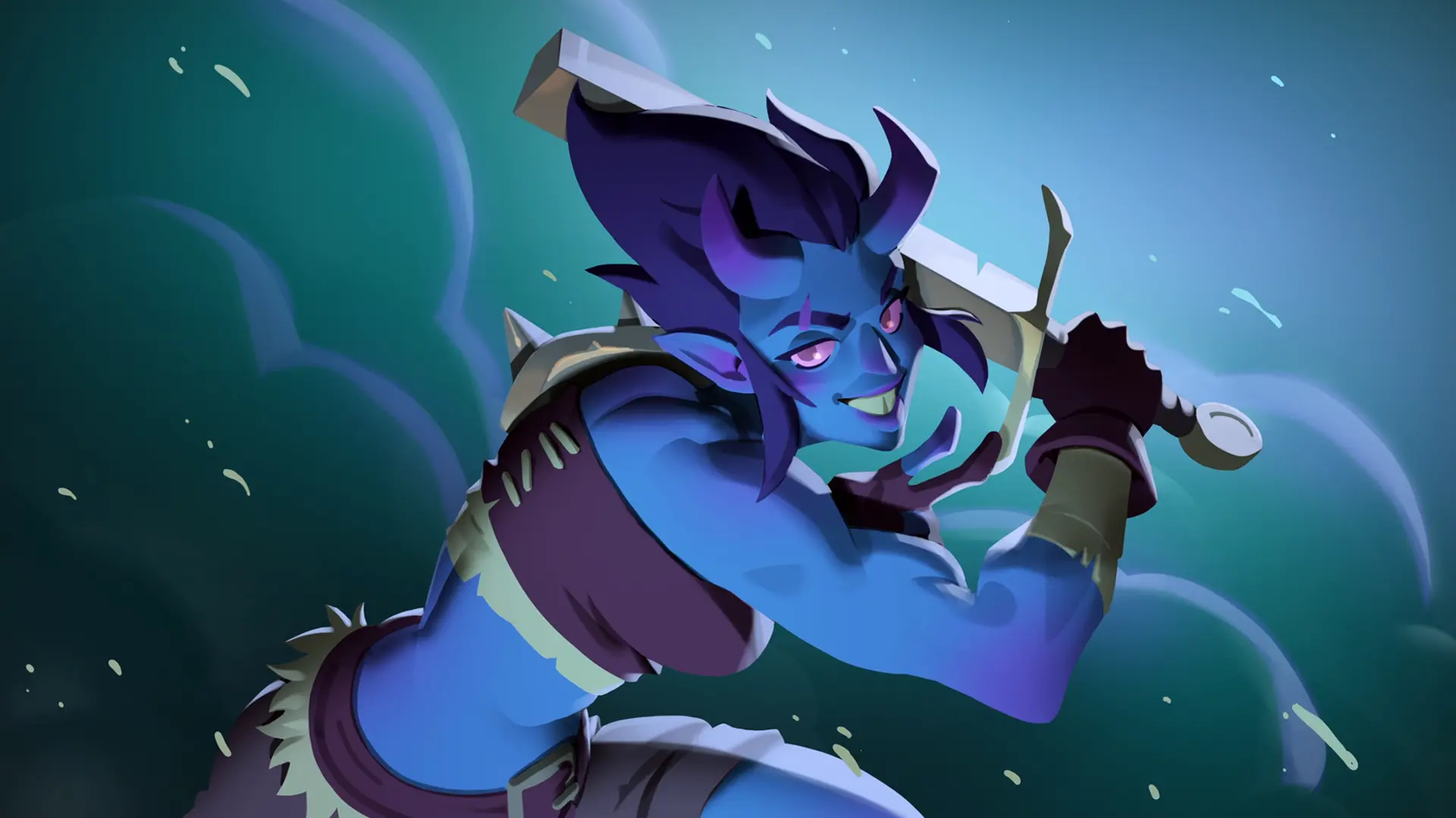
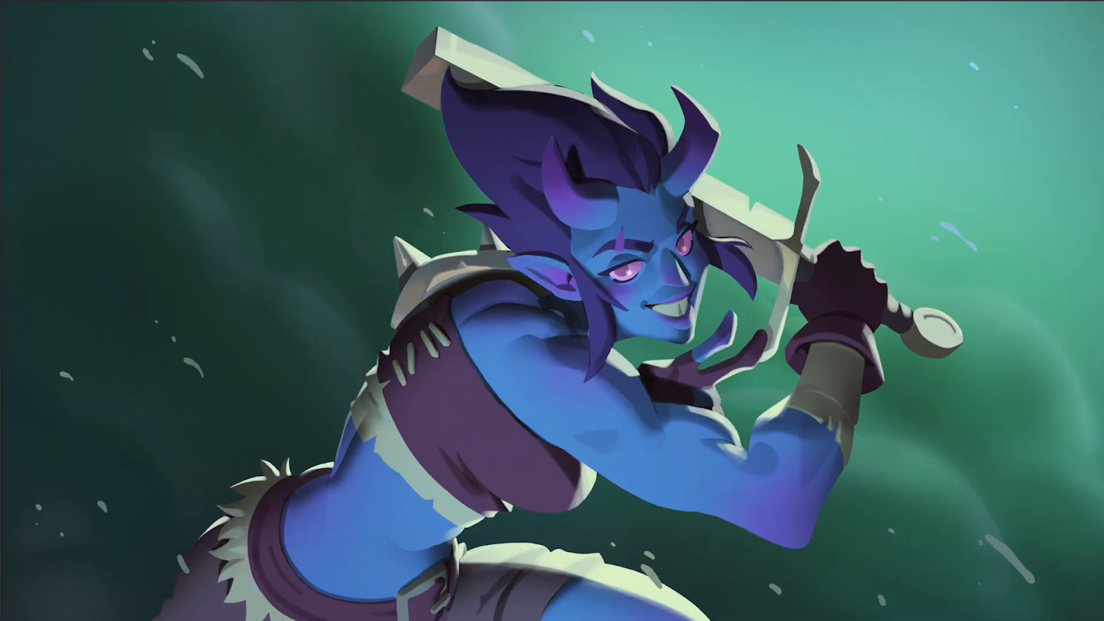
Value (also referred to as ‘brightness’ or ‘lightness’) is all about how light or dark a color is. Imagine a grayscale version of your artwork—those shades of gray are the values. Even without hue, value alone creates depth, focus, and drama 💡
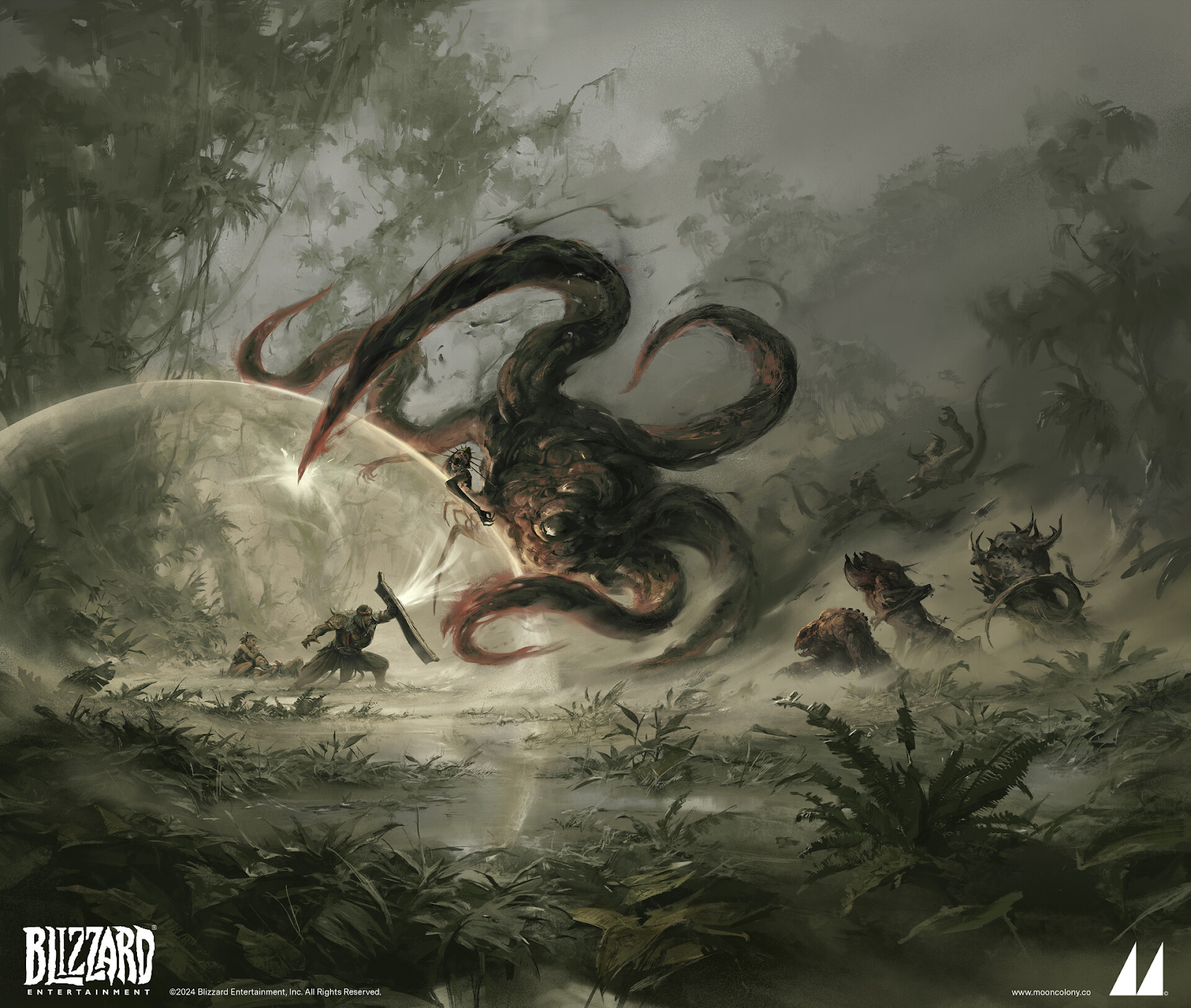
When it comes to readability, value is the #1 most important element to get right. When your image is converted to grayscale, you should be able to tell what’s going on instantly. This is why you’ll often see digital artists planning illustrations with grayscale thumbnails—they’re making sure they nail their values first!
🏆 Why Value Is King:
- Depth & contrast – Good value control creates a sense of realism by defining light sources and forms. Poor value contrast = muddy, unreadable images.
- Guiding the player’s eye – High contrast draws attention. If your main character blends into the background, players will struggle to focus on them.
- Works even in grayscale – If your composition looks solid in black and white, it’s a sign of strong value structure.
Tip: Squint at your artwork or use a grayscale filter to check your values. If things blur together, you need to tweak those light and dark areas 👁️
Different Hues = Different Values
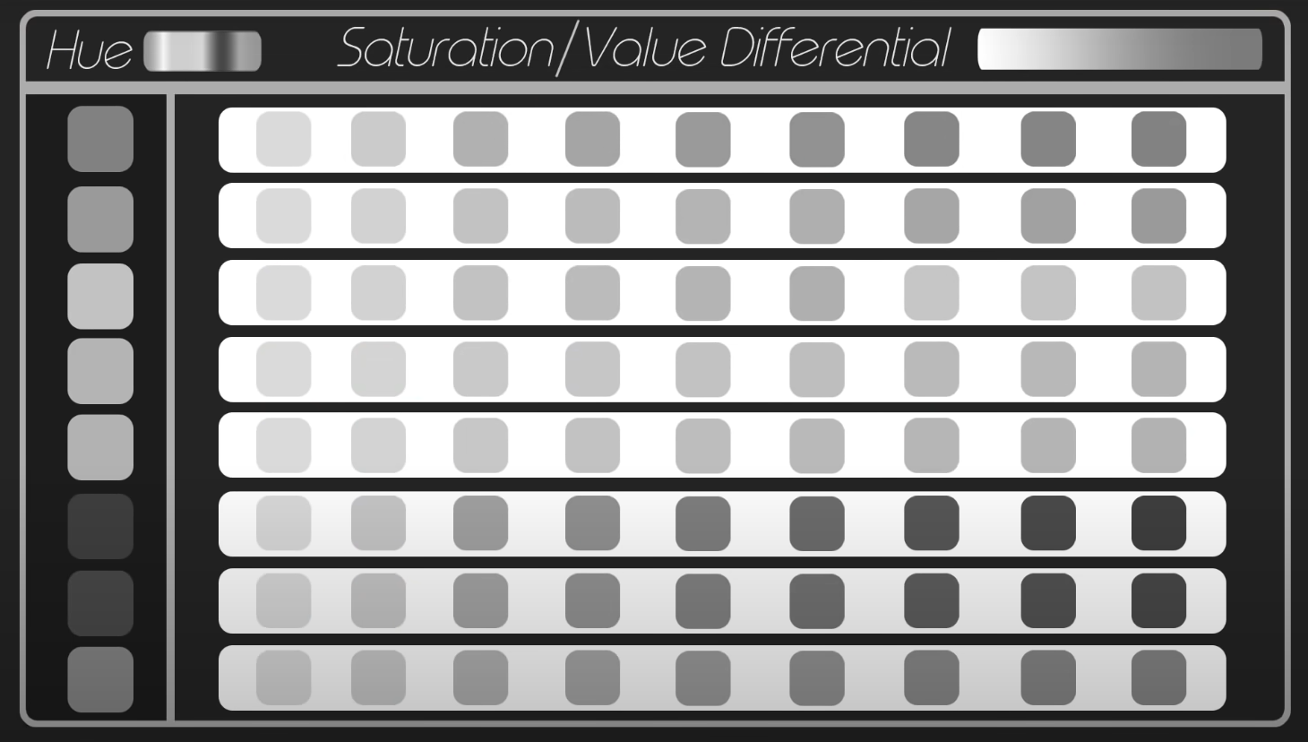
Another interesting value tip: when different hues are at maximum saturation, they possess different levels of inherent brightness. For instance, when viewed in grayscale, a pure yellow will be lighter than a pure blue. This is crucial to bear in mind when planning your value composition!
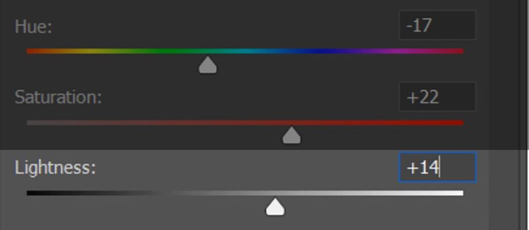
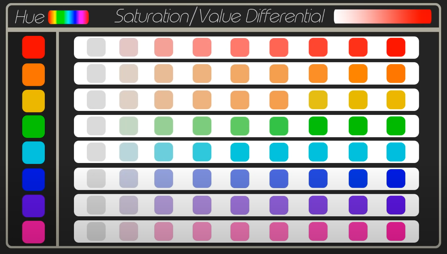
🌈 Saturation: How MUCH Color?
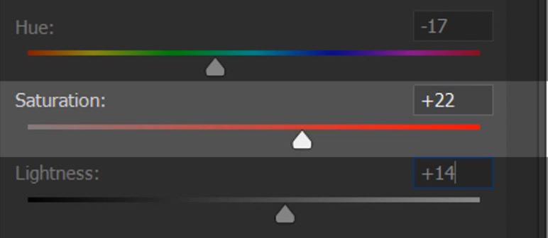
Saturation refers to how intense or muted a color is. Highly saturated colors are bold and vibrant, while desaturated colors are more subdued and closer to gray. Think of it as the difference between neon lights and foggy landscapes 🌁
Understanding saturation will help you create focal points, set the mood, and avoid overwhelming the viewer with too much intensity. The art direction of different games will also dictate how saturated your work is.
🎯 Why Saturation Control Matters:
- Focus & emphasis – A splash of saturation in a mostly muted scene immediately draws the eye.
- Atmosphere & realism – Due to atmospheric perspective, colors lose saturation as they recede into the distance. Use this trick to add depth to environments.
- Balancing realism and stylization – Over-saturated artwork can feel cartoonish, while under-saturated work can feel dull. You’ll need to find a balance depending on the style you’re going for.
Tip: Reserve your most saturated colors for areas of interest. For a character’s glowing sword, crank that saturation. Dial it way down for a dark, misty background 😶🌫️
🚀 Bringing It All Together: The Power Trio in Action

Think of hue, value, and saturation as a three-part harmony. If one is off, the whole piece can feel disjointed.
- If your colors feel wrong, rethink your hues.
- If your painting looks flat, check your values.
- If your scene feels too chaotic or too dull, adjust your saturation.
Whether you’re a concept artist or an illustrator, understanding these three elements is crucial to getting your work to a professional level. Mastering them isn’t about following rigid rules. It’s about understanding how they work together to guide the viewer’s eye and tell a compelling visual story.
The more you practice, the more intuitive it will become. And before you know it, you'll be making colors work for you, not against you! ✨
Need help mastering the art of digital painting? Join legendary game artist Alexandre Leoni in his beginner-friendly course Digital Painting 101 here, and develop a rock-solid professional painting process.


.svg)


Oops! Something went wrong while submitting the form.


Join our mailing list
By clicking subscribe, you acknowledge that your information will be transferred to Mailchimp for processing. Learn more about Mailchimp's privacy practices.